How we rebuilt Trenzo’s store and made its ads pay

Trenzo sells premium wallets and card holders across Bangladesh. We redesigned its online store from scratch, set up proper tracking and took over its Meta ads, so every taka spent could be traced to a sale.

  • Ecommerce
  • Store redesign
  • Meta ads
trenzobd.com
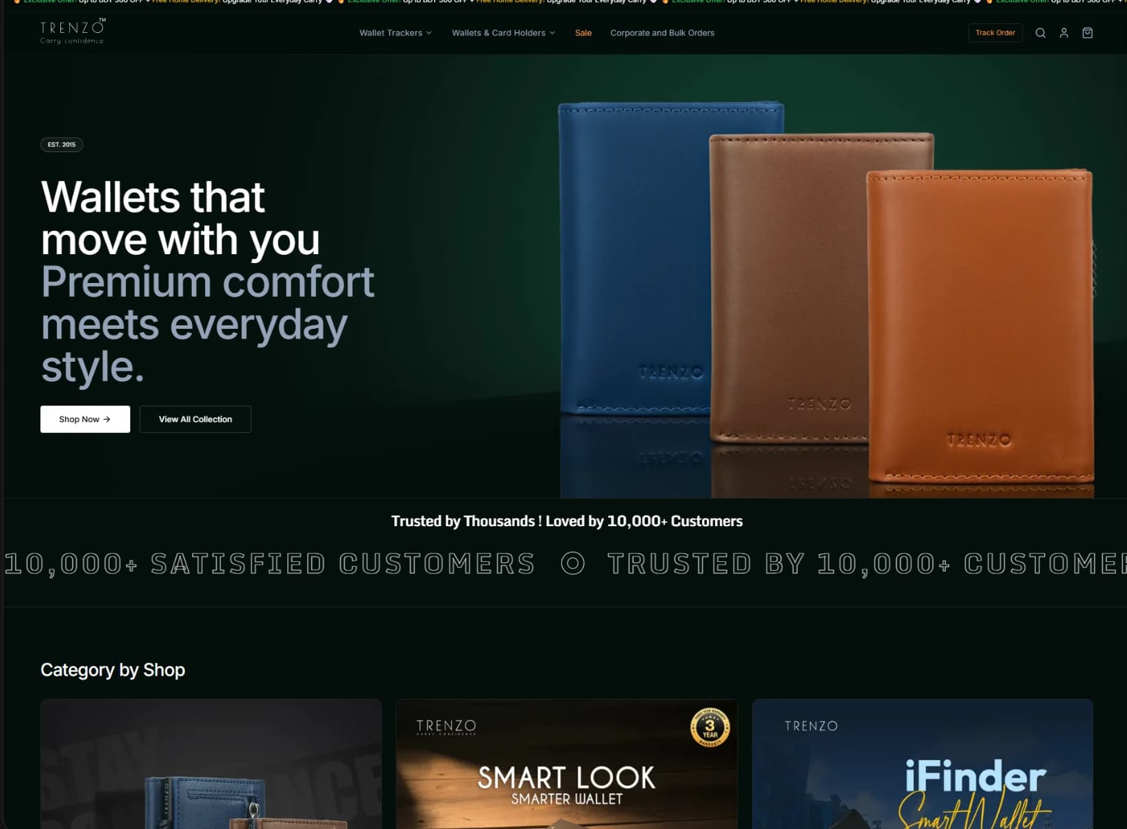
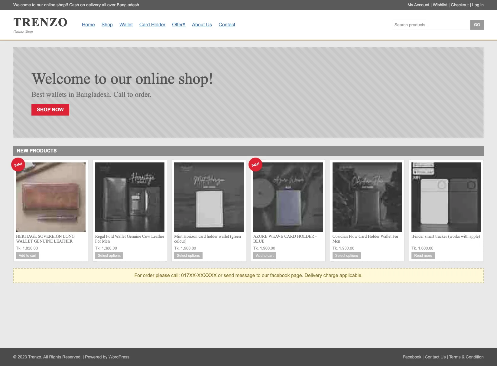
Trenzo online store homepage
−41%Cost per purchase3.7×Website purchases
Industry
Wallets & accessories
Services
Store redesign + Meta ads
Market
Bangladesh
Result
3.7× website purchases
The Starting Point

A great product, held back online

Trenzo's wallets were premium, but its old online store didn't sell like it. Product pages left buyers with questions, checkout asked for too much, and every website sale was costing ৳297 in Meta ads.

We rebuilt the store around how people actually buy a wallet: clear product pages, custom engraving and a short checkout. Then we relaunched the ads with full purchase tracking.

trenzobd.com
Trenzo store: old design on the left, new design on the right
Old storeNew store

Drag the handle to compare. The old store is an illustrated recreation.

  • Mobile-first design

    Built for the phones most customers shop on.

  • Faster checkout

    Name, phone and address, with cash on delivery, SSLCommerz and bKash.

  • Custom engraving

    Names or logos laser-engraved, chosen and previewed on the product page.

  • Bulk-order channel

    A separate path for wholesale and corporate buyers.

Page by Page

Where customers browse, decide and buy

Three pages make or break an online sale. Here’s how each one changed.

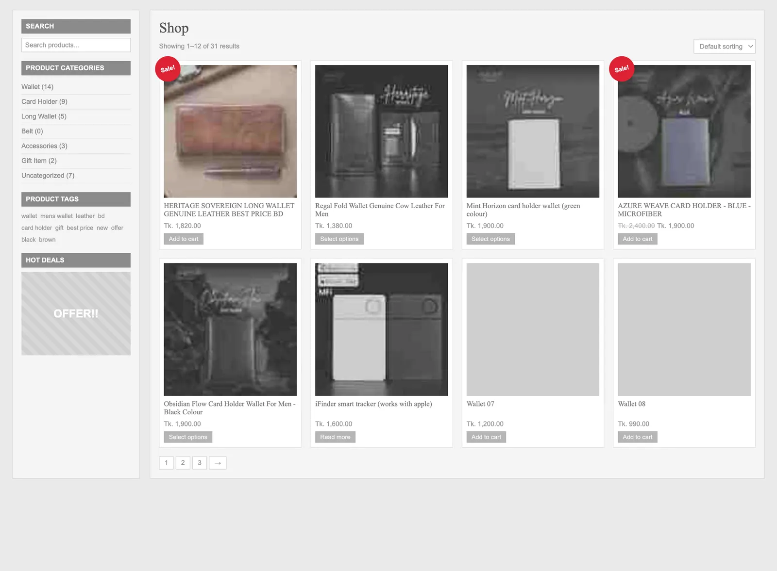
01 · Shop page

A shop that helps customers find the right wallet

The old shop was one long list sorted by nothing in particular. Now customers narrow it down by colour, price, feature and material, and every product looks its best.

trenzobd.com/products
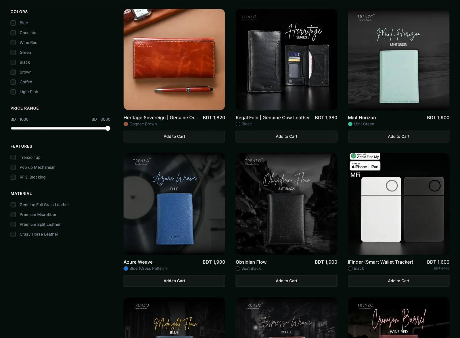
Trenzo shop page: old design on the left, new design on the right
Old shop pageNew shop page

Drag the handle to compare. Old pages are illustrated recreations.

Before

  • Washed-out photos in a cramped grid
  • No filters, just categories and a pile of tags
  • Long, inconsistent product names
  • Colour and options hidden until the product page

After

  • Filters for colour, price, features and material
  • Large, consistent product photos
  • Colour shown on every card, with price alongside
  • Add to Cart right from the shop

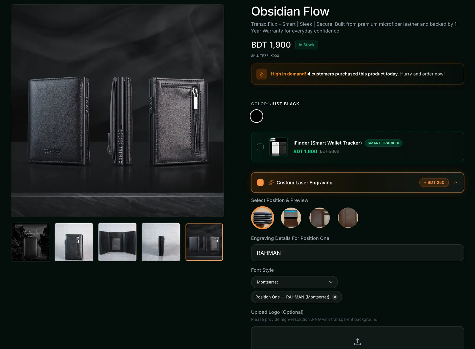
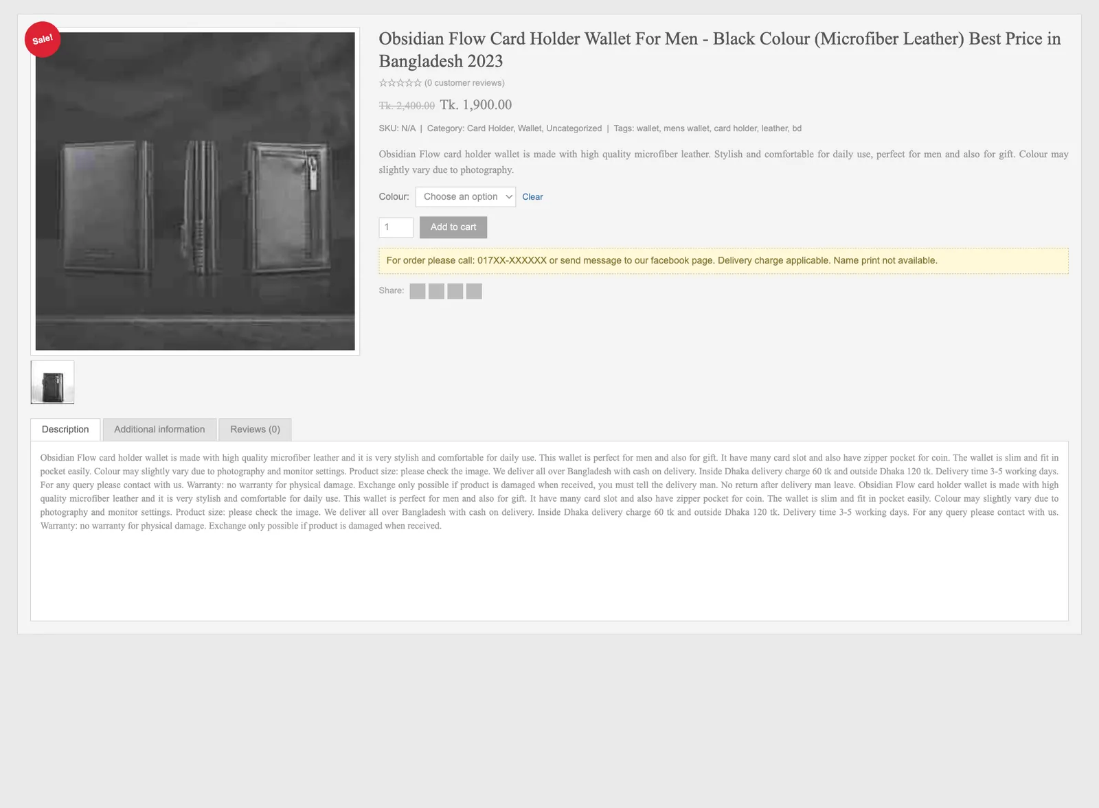
02 · Product page

Product pages that make the decision easy

The product page is where customers decide. The old one made them dig for answers; the new one puts everything they need to say yes in one clear view.

trenzobd.com/product/obsidian-flow
Trenzo product page: old design on the left, new design on the right
Old product pageNew product page

Drag the handle to compare. Old pages are illustrated recreations.

Before

  • Small, dull photos with no gallery
  • Price, stock and options hard to spot
  • One long wall of text instead of clear details
  • Orders by phone call or Facebook message

After

  • Large photo gallery showing every angle
  • Price, stock and colour clear at a glance
  • Custom laser engraving with position preview
  • Order Now and Add to Cart side by side
  • Smart tracker add-on in one tap

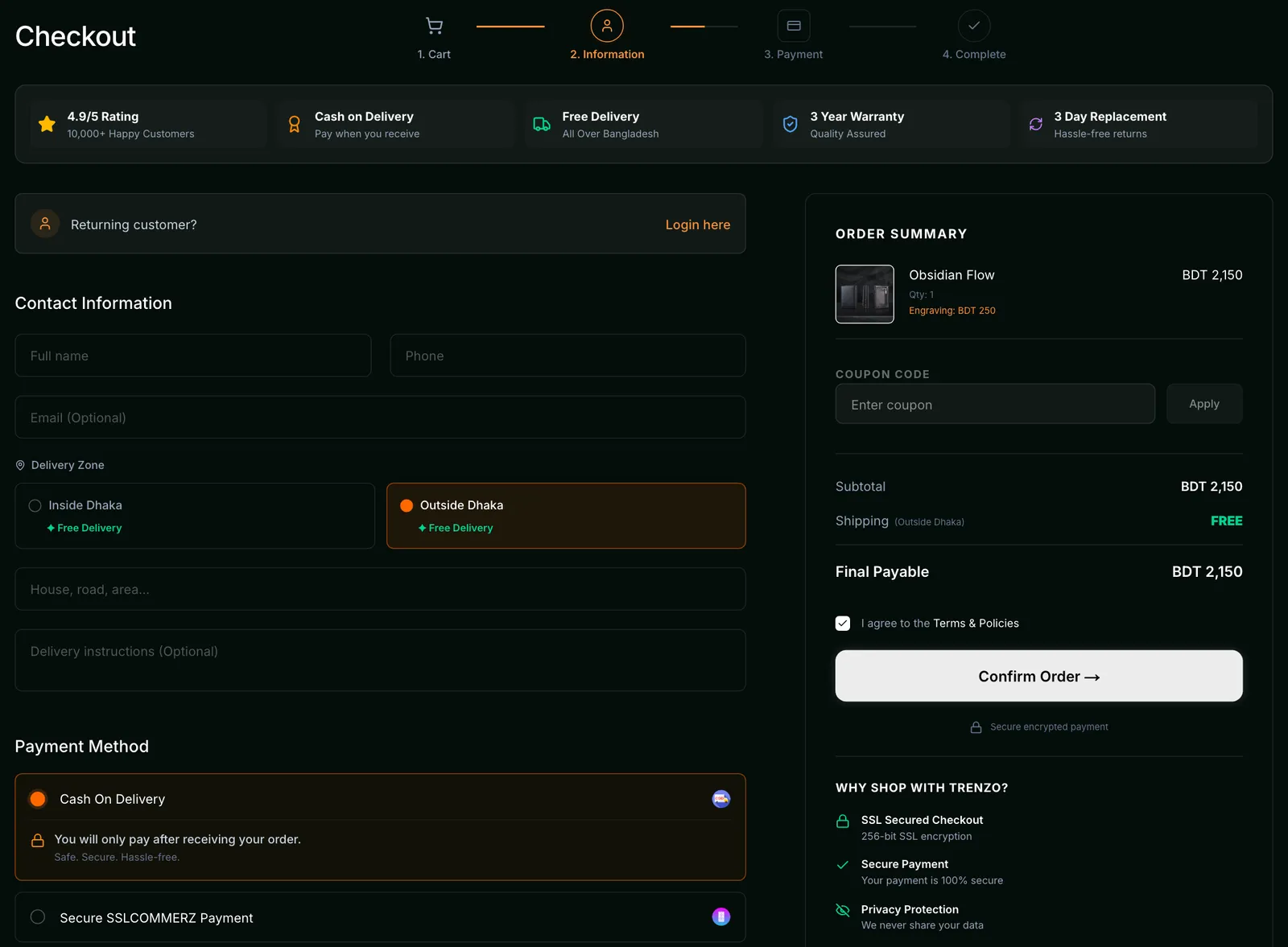
03 · Checkout

A checkout that gets out of the way

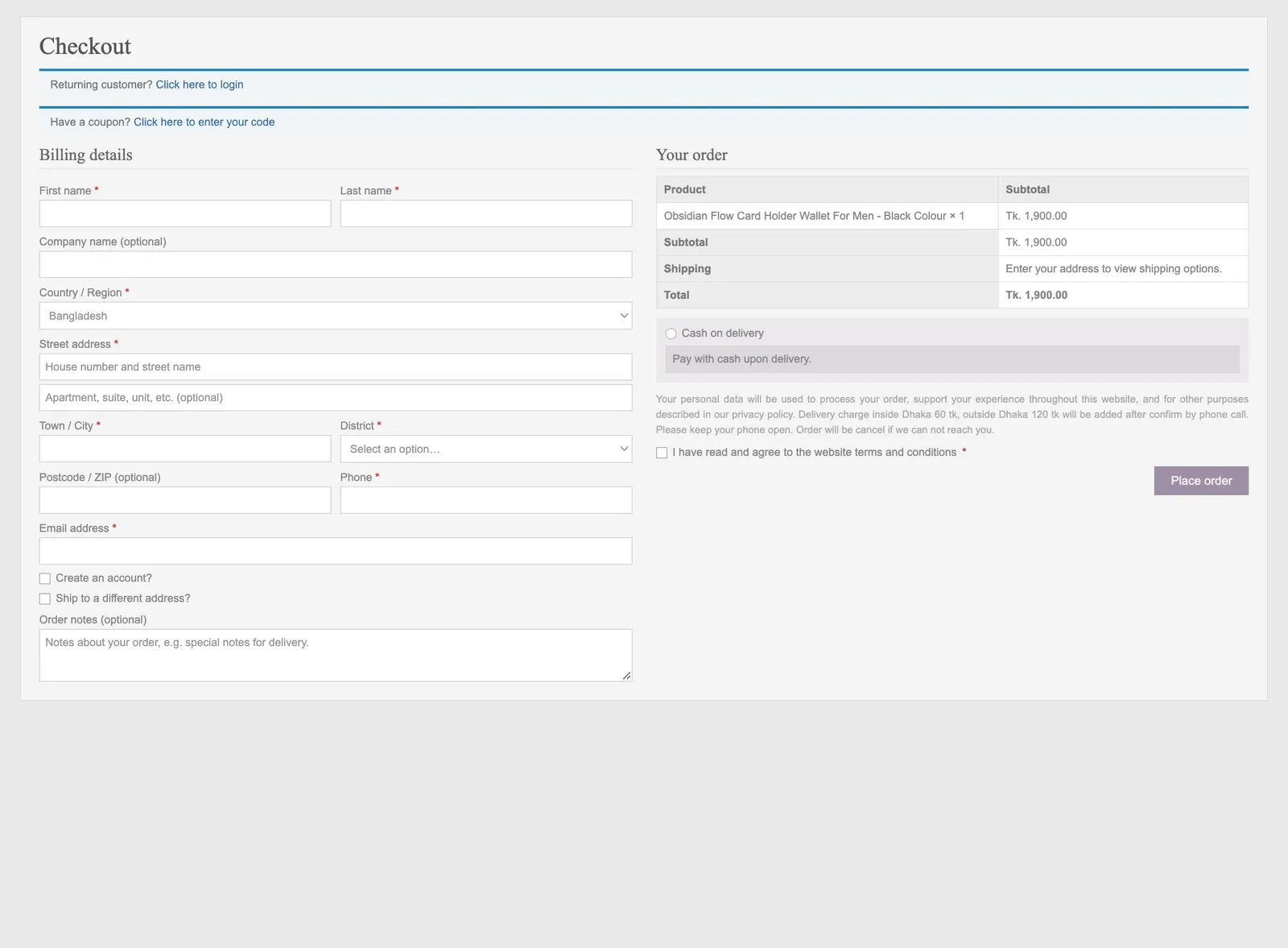
Fewer fields, clear steps and every way to pay. Customers see exactly what they're getting, engraving included, and finish the order in a minute.

trenzobd.com/checkout
Trenzo checkout: old design on the left, new design on the right
Old checkoutNew checkout

Drag the handle to compare. Old pages are illustrated recreations.

Before

  • 12 fields to fill, most of them not needed
  • Shipping cost hidden until a phone call
  • Cash on delivery as the only way to pay
  • No engraving or personal touch

After

  • Just name, phone and address
  • 4-step progress bar and free delivery shown upfront
  • Cash on delivery, SSLCommerz and bKash
  • Engraving carried into the order summary
  • Warranty and replacement promises right before paying
Challenges & Solutions

Every problem, solved

  1. Challenge: Product pages left buyers with questions.

    Solution: A photo gallery, clear price, stock and options, and full details on every product.

  2. Challenge: Checkout asked for too much before a sale.

    Solution: A short checkout: name, phone and address, with three ways to pay.

  3. Challenge: Every website sale cost ৳297 in ads.

    Solution: Meta Pixel and Conversion API set up so ads optimise for real purchases. Cost per sale fell to ৳176.

  4. Challenge: Bulk and corporate buyers had no clear way to order.

    Solution: A dedicated corporate and bulk-order page alongside the store.

The Results

Less spent per sale, many more sales

Straight from Trenzo’s Meta Ads Manager, before and after the new store went live.

  • Cost per purchase

    −41%

    Before

    ৳297

    After

    ৳176

  • Website purchases

    3.7×

    Before

    194

    After

    721

  • Ad spend, scaled up

    2.2×

    Before

    ৳57.7k

    After

    ৳126.7k

Straight from Meta Ads Manager: before the new store, then after. Tap a report to see it full size.

“Working with WebBrik was a genuinely pleasant experience. From the beginning, the team showed strong professionalism and a clear understanding of our vision. They were responsive, supportive, and always open to feedback. The final website came out exactly how we wanted, both in design and functionality. Really appreciate the effort and dedication from the team. Happy to recommend them to anyone looking for quality web development work.”
TTrenzoClientRead it on Google(opens in a new tab)

Ready to grow your business online?

Book a free consultation and tell us what you want to build. We reply within one business day.

Contact

Let’s start the conversation

Tell us about your project. We’ll come back with questions, a rough scope and an honest estimate.

  • Reply within one business day
  • Written scope & estimate
  • No commitment to talk
  • NDA on request

Tell us what you’re building

Fields marked * are required.

We reply within one business day.